DESIGN PROCESS
This
week ITAP lecture was about the importance of the design process when creating
visual messages and building communication with the audience.
The
first principle I want to talk about is Legibility.
Legibility
is the degree to which individual
characters in the text are understandable and recognizable based on their
appearance.
It is very easy to lose meaning and purpose of
our aim if we don’t follow some rules. First of all is to recognise the
audience and choose appropriate style. In writing or text and image that
includes: typeface, font size, clear image, composition, paragraphs, colour,
spacing, alignment, layout of the image and text on the page and additional
content together, all the above must be suitable for presented image to
communicate the right message. There are other rules when creating magazine
layouts: columns, margins, headlines, sub headlines etc. It is good to ask
ourselves a question: Does it connect with the target audience? We must decide
on the level of legibility depending on the purpose and the audience. It is
also used in commercial visual communication such as maps, signs, instructions
etc. Each project has a different purpose for instance informative,
instructing, persuasive or convincing. If our goal is to clearly inform the
target group and enable them to gain information the above rules can help to
maintain final outlook. Whereas when we use words overlapping the image it
might be illegible.
I
think is very important to make my blog legible and for that reason I have used
bigger font size , a clear typeface, chosen colours of font and background.
Tone of voice
Tone
of voice must be taken into consideration when we aim to communicate visually
with a target audience. Very often, apart from the image, we also apply text
which more distinctively emphasises the message we are sending. We do not always
appreciate that Typography is everywhere. It is a huge part of advertising,
publishing, packaging etc.
It
is particularly chosen for certain groups of people create the right impression
and reaction, for instance to buy the advertised product.
We
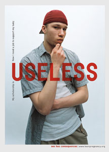
can find Ideal connection of text and image in the ‘Sex has consequences’
advertisement for The National Campaign to Prevent Teen and Unplanned Pregnancy.
Tony Arefin is a graphic designer who cleverly works with typography and very
often combines it with photography. The theme of the campaign is to encourage
teenagers to have safe sex. He uses very strong quotes and picks out words
highlighting the valuable meaning for
the theme. He accentuates the words even more using strong red colour which is
a very emotionally intense and stimulates people to make a quick decision but
also indicates danger.
Paula
Scher is a graphic designer who uses historical design for the contemporary
audience.
 |
| Rihanna's latest album cover |
Image source:
http://www.justjared.com/photo-gallery/2402246/caleb-followill-spin-magazine-cover-kings-of-leon-02/


